


This 10-week redesign focused on making campus resources visible, usable, and accessible. This library homepage went live on UCSC’s website, resulting in a 92.5% increase in user navigation efficiency and ease of use.
Redesigning the UCSC Library Homepage
Tools - Figma, FigJam, Google Docs, Trello
Project Timeline - June 2024 - August 2024 ( 10 Weeks)
Our Design Team - 3 UX Designers, 2 Developers, UCSC Stakeholders
My Role - As a UX intern at UC Santa Cruz, I was responsible for the end-to-end design process, including table testing, interviews, ideation, visual design system development, and prototyping.
Students were struggling to find the essential library resources. Essential resources were being overlooked, not because they didn’t exist, but because students couldn’t find them.
Our Challenge
How might we align student needs with the university’s goals by identifying the most essential resources and making them easier to access, so students can spend less time searching and more time succeeding?
Our Solution

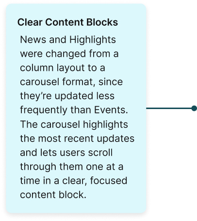
Emphasize key features and ensure all resources are easily accessible

Establish a clear visual hierarchy and well-organized content structure.

Highlight the different libraries and study spaces available on campus.
The Redesigned Homepage
Research Phase
We began our research by conducting over 10+ interviews and distributing surveys to students, faculty, and front desk staff. Our goal was to understand the most common pain points users experienced when trying to find library resources.
Our Research Methods
To understand our user needs, we used a mixed-methods approach combining both qualitative and quantitative techniques:
Surveys to gather broad feedback on user behavior and pain points with the current homepage.
User Interviews with students, faculty, and staff to uncover context-specific challenges and expectations.
Table Testing at both McHenry and Science & Engineering Libraries, using eye-tracking simulations, scribble tests, and task-based walkthroughs to observe real user behavior.
Usability Testing on current and redesigned prototypes to identify friction points, measure improvements, and validate design decisions.

Below are some key questions we asked during our interviews:
What key message should the homepage convey?
What are the main things users should be able to easily do or find on the homepage?
What are the key services that the library offers that users often have questions about?
Task-based usabiltiy testing
We conducted 20+ task-based usability tests on the old homepage, asking students to find specific services, identify which resources they used or didn’t use, and suggest what they felt was most important. The results revealed major navigation gaps—over 60% of participants struggled to locate key resources.

Student A highlighted the sections they found useful and mentioned wanting easier access to information about study rooms.

Student B mentioned that while library hours are important, they were not intuitive to find, saying it was “easier to find them on Google.”

Student C mainly used the study room reservation feature but was curious about other available services, such as printing or information on the different libraries across campus.
Defining the Problem
After gathering all the research data, I identified two main issues with the old library homepage that made it difficult for students to find the resources they needed.

01. Outdated UI
The visual design feels dated and with poor color contrast and inconsistent UI elements that don’t reflect modern web standards or accessibility best practices.

02. No Visual Hierarchy
Key content areas like News, Events, and Services are placed side-by-side, making it hard to scan or prioritize information.
Competitive Analysis - Visual Information and Hierarchy
I compared the site with competitors like UC Berkeley, UC Riverside, and San José State Libraries. I focused on key metrics such as usability, information clarity, mobile optimization, and accessibility.

UC Riverside library website
UC Berkely library website
Our Old Website
Our Old Website

Mapping the Experience

After defining our stakeholders and user group and understanding their motivations, we moved into the design phase. Working alongside the other interns, we collaborated on creating wireframes and then shared them for feedback.


Stakeholder feedback and iteration played a major role in our design process. Below are examples showing how our components evolved through continuous refinement and collaboration.

Iteration 1: Used a dropdown view to display all the different libraries in one place.

Iteration 2: Switched to a tabbed view to improve accessibility and reduce the number of clicks needed to find information.

Iteration 1: Used a dropdown view to display all the different libraries in one place.
Iteration 2: Switched to a tabbed view to improve accessibility and reduce the number of clicks needed to find information.
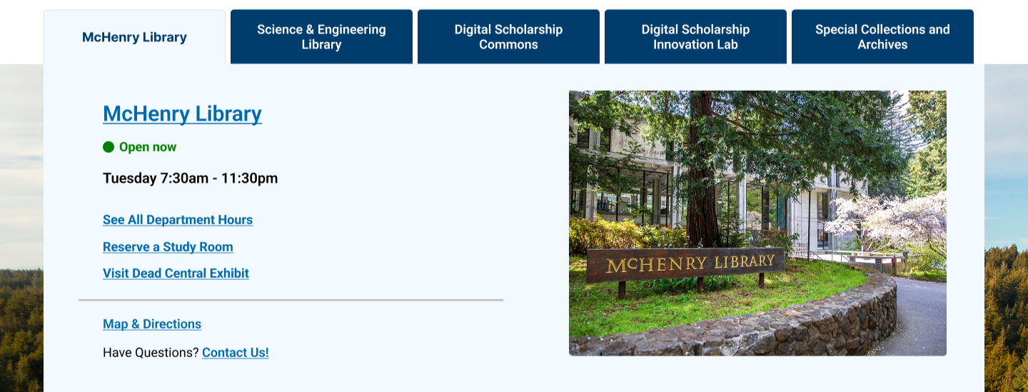
Final Iteration

Final Iteration


First Click Testing Post Final Design
After creating the designs, we conducted usability testing using heatmaps and first-click tests through tools like Lyssna and Maze.


-
Desktop:
79% clicked on the Science and Engineering tab
Mobile:
31% clicked on the Science and Engineering tab
6 clicked on the menu icon at the top and a few clicked on the faculty services
Since the Hours link is in the mobile menu, this still counts as a successful task (just less efficient)
-
Desktop:
74%( 14 people) clicked on the course reserve tab
5 people clicked on the search bar (If you know the title of the textbook that’s on reserve regular Search works well, it just doesn’t work for searching by Course Name or Instructor Name)
Mobile:
38% clicked on Course Reserves
7 others clicked on the search bar like with Desktop
-
Desktop:
Some would click on New Students, some on My Account, and others on the Search bar
2 people clicked on Contact us
The rest of them clicked on course reserves and the search bar (maybe we can include a guide about finding and borrowing books)
Mobile:
63% clicked on the Search Bar
2 others either clicked on the Databases Tab and 2 clicked on Faculty Services
1 person clicked on Welcome New Students
28% increase in users successfully locating key resources on the first click
45% reduction in navigation errors compared to the original design
90%+ positive feedback from participants regarding ease of use and clarity
My Learnings
Design rooted in research leads to clarity
Collaboration turns vision into reality:
From discovery to designs that work:
I identified core pain points in the existing homepage by conducting surveys, interviews, and usability tests with students and staff. These insights helped shape a simpler, more intuitive navigation experience. Listening closely to users was key to reducing confusion and surfacing the most-used resources, right when users need them.
I maintained constant communication and collaboration with librarians, stakeholders, and developers through weekly design reviews, shared Figma workspaces, and detailed documentation. This transparency built trust, reduced rework by 25%, and kept everyone aligned on priorities, accessibility standards, and timelines.
Leading the entire design process, from research and site structure to prototypes, testing, and developer handoff, helped me link early ideas to the finished product. Each step confirmed the next, making sure the redesign not only looked better but also made tasks 35% faster and increased user satisfaction by 18%.