
Building UC Santa Cruz Library’s First Design System
As part of the UC Santa Cruz Library website redesign, my team and I developed a scalable design system with an inventory of over 20 components, focusing on accessibility and optimization for both web and mobile platforms.

Project Overview
Client - University of California, Santa Cruz Library.
Tools - Figma, FigJam, Google Docs, Trello
Timeline - January 2025 - August 2025 ( 12 Weeks)
Team - 2 UX Designers, 1 Developer
My Role - Collaborated on design and documented the UC Santa Cruz Library’s first design system. Our process included peer research, competitive analysis using Material Design 3 and other established systems, building a component inventory, and iterative design refinement.
Project Impact- We delivered a finished design system approved by stakeholders, which is now in the implementation process to ensure consistency for all users and future designs across the entire website.
The problem without a design system
Before the design system was implemented, the UC Santa Cruz Library website had inconsistencies and fragmentation.
01
Inconsistent components & poor scalability
Different pages had been created by various contributors, which led to mismatched typography, colors, and layouts.
Accessibility standards were also applied unevenly, which risked excluding some users.
02
Accessibility Issues
There was no unified style or structure, making it harder for users to navigate and for developers to maintain.
03
Slower Design Developments
Some components from the old website

Different buttons and interaction styles
Multiple tab styles and spacing


Harsh shadows and inconsistent icon and link size

Grey background, rounded edges, inconsistant link styling

Inconsistent Search box design, different button sizes
Goals for the design system
My goal was to develop the UC Library’s first design system, designed to:
Create reusable tokens and components for consistency

Provide clear documentation for designers and developers
Improve accessibility (WCAG 2.2 compliance)
Where did we begin?
Component Audit: documenting over 200+ library webpages and components, finding various decrepacies in typography, colors, and layouts.


Learning the basics of design system: I compared design systems from other UC campuses to understand how they are used within higher education and edtech platforms. I also studied Google’s Material Design and IBM’s design system to learn from established industry standards and best practices.
Designing
I used Atomic Design to structure the new design system, breaking the UI into modular components that ensured consistency and scalability across over 200 pages.
Colors
After conducting research, we developed a new set of colors that still aligns with the university’s brand palette. We validated these proposed colors using accessibility contrast checks and color-blindness simulations to ensure they are fully accessible. Rebuilt palette to ensure 4.5:1 contrast ratios for text and 3:1 for UI components
Old Colors

I introduced a secondary color layer and clearly documented both ‘container colors’ and corresponding ‘on-container’ text colors, helping designers and developers better understand and implement the visual system
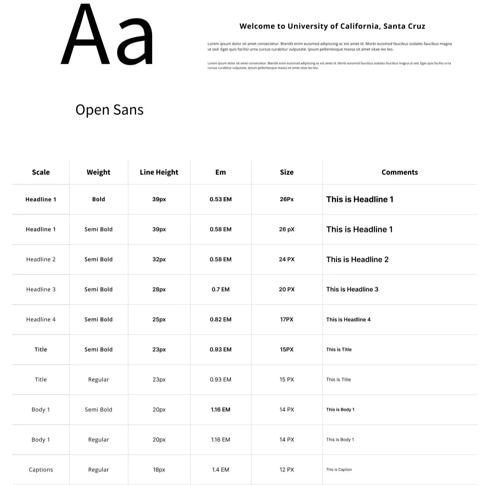
Typography
Through research, I found that our previous typography was difficult to read and did not meet accessibility standards at smaller font sizes, especially on mobile. To address this, I developed a more versatile and accessible font library.
Desktop
Mobile
Buttons, Pagination, Form fields
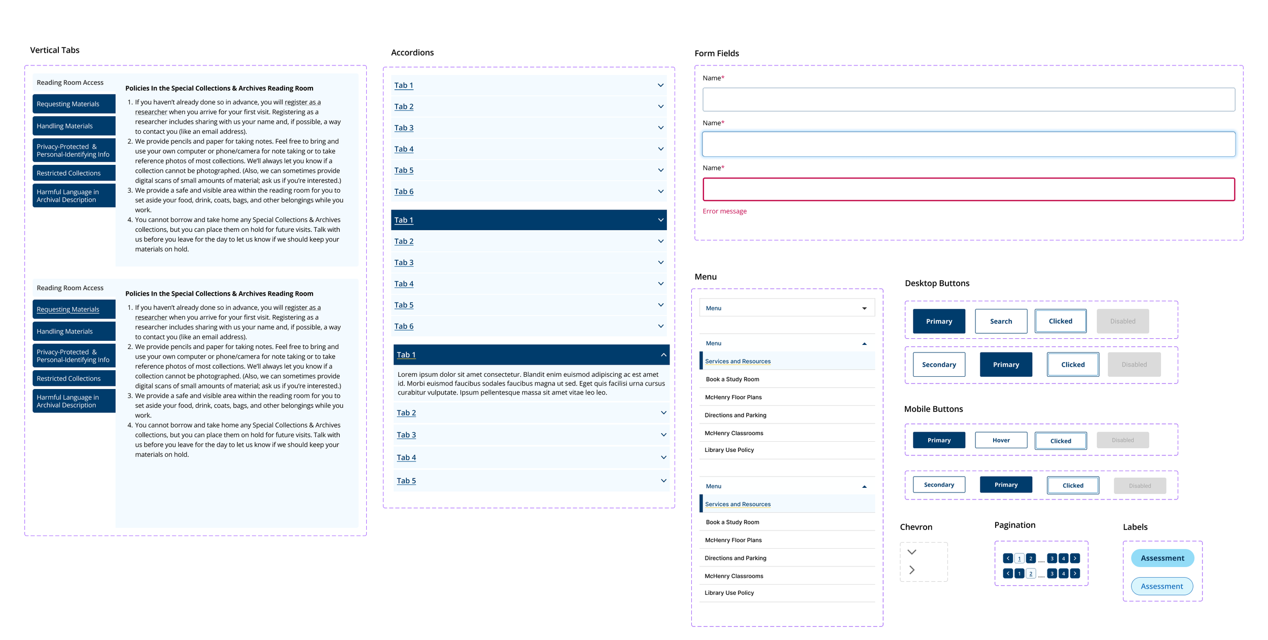
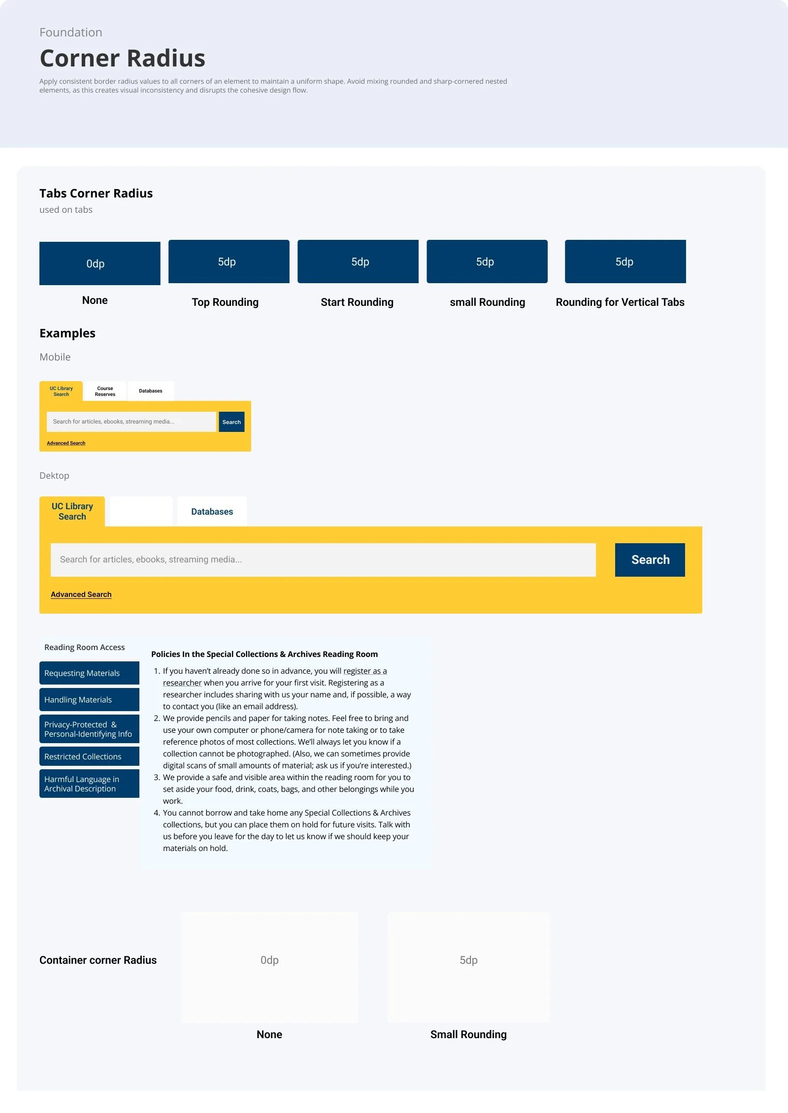
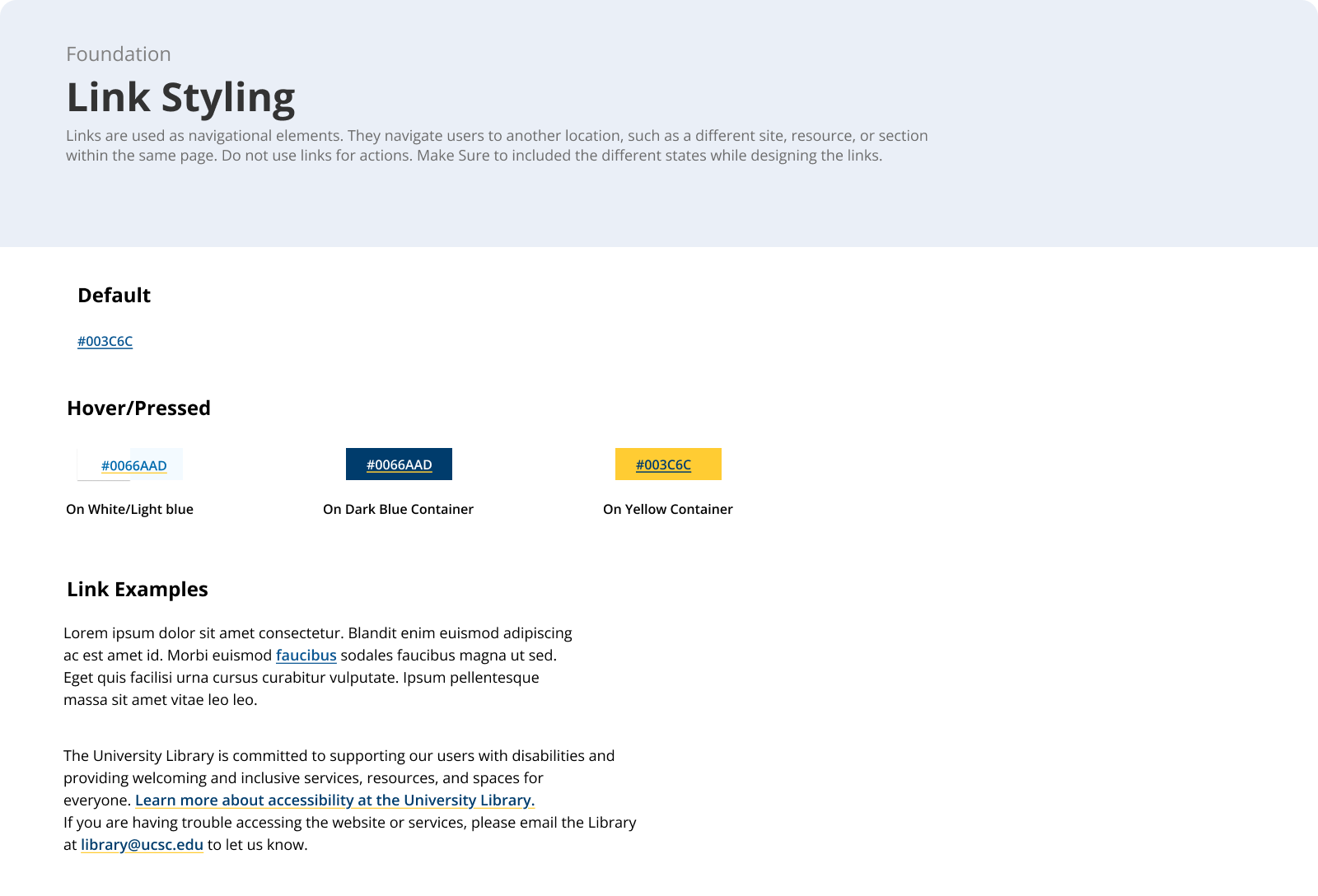
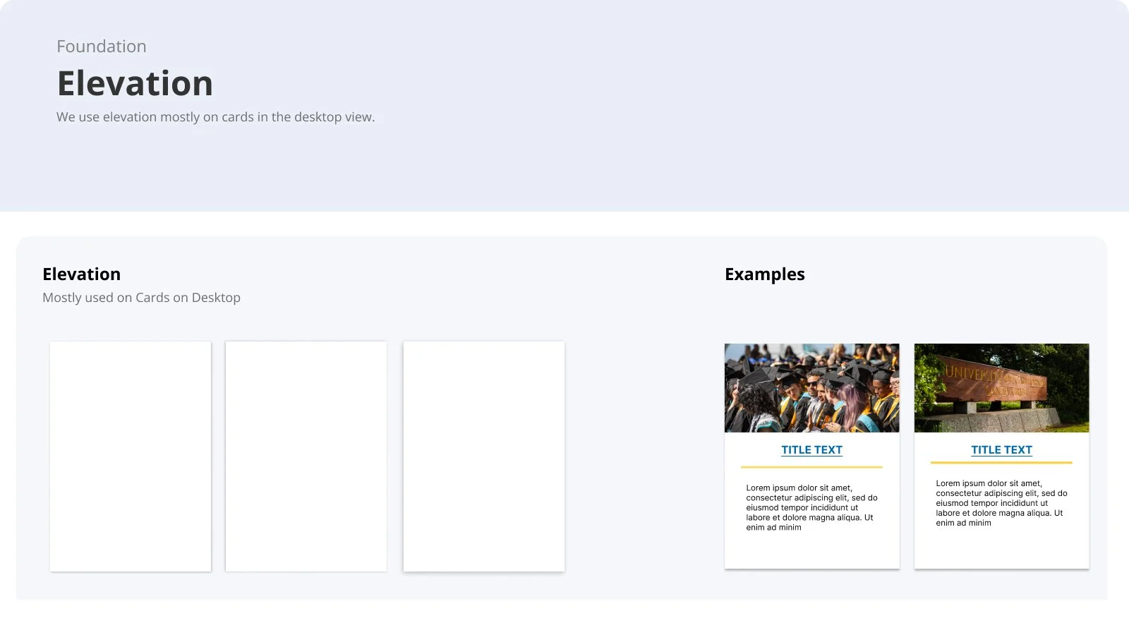
Link styling, Icons, Elevation, Corner Radious
Next, I defined consistent sizing for corner radius, elevation, and link styling. I also created clear documentation explaining when and how to use each element. This ensures designers and developers can apply these styles confidently and maintain visual consistency across the entire system.
New Colors
Learning
Collaboration and System Thinking
Reusable Components and Design Tokens
Documentation for Designers and Developers
The project emphasized the importance of thinking about design at a systemic level. I learned how a thoughtfully crafted design system supports team collaboration, long-term maintenance, and the overall user experience.
Developing reusable components and tokens taught me how a design system can increase efficiency, maintain visual consistency, and scale effectively across multiple projects.
Creating clear, structured documentation helped bridge the gap between design and development. I learned how well-documented components, guidelines, and tokens make implementation consistent, reduce confusion, and improve collaboration across teams.